The Pixel Weather app may be receiving an update, a rollout of a visual redesign. The weather icons in the app will be redesigned (sun/clouds/drizzle/storms). These redesigned icons have been showcased by some users who recently posted photos of their app updates.
Users have also indicated that the redesign of application icons is both more modern and bolder than the existing icons, plus some layout changes. All users will notice small layout changes upon downloading the app update.
Since these are just being tested at this point, most users currently on Pixel will not be able to access this update yet.
Quick Look at What Is Changing in the Pixel Weather app
Based on the screenshots shared online, here are the main things noticed in the Pixel Weather app’s test version.
- New weather icons with darker outlines
- Icons look simpler than before
- Shapes are easier to see at a quick look
- Small change in how saved cities can be moved in the list
These are not big changes, but they can make the Google Pixel weather app interface easier to read and navigate when checking the weather quickly.
Pixel Weather App Testing New Icon Style
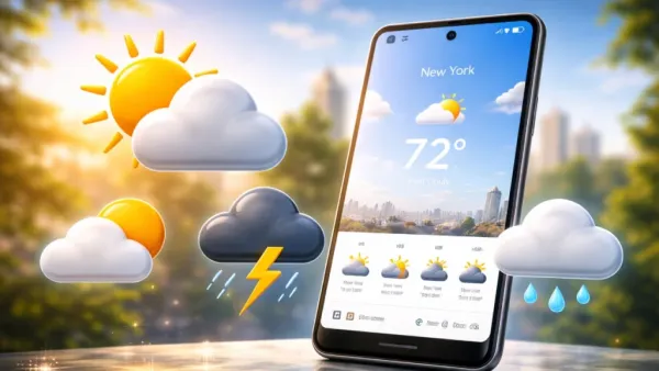
In the most recent version of PIXEL’s weather application, weather icons also changed their appearance. Currently, ICONS are in PASTEL colors and LIGHT shades; they LOOK very nice but do NOT provide adequate detail in some cases.
In the test version of the Pixel Weather app, Google is trying icons that look simpler. The shapes are clean, and the outlines are darker. As an example, the sun symbol is now more visible thanks to the rays that surround it, which are very obvious due to their upright position and thickness/density.
The cloud symbols are now also thicker than before. And although the raindrop and thunderstorm symbols still show the same weather condition, they have been around forever; they are more visually distinct. These small design improvements can make the Google Pixel weather forecast experience faster and more convenient.
The intent appears to be to enhance the ability to identify an icon visually as quickly as possible. Google frequently updates its apps to match its evolving Material Design philosophy, and this icon redesign may be part of that broader visual refresh.
Why Google May Be Doing This
A clear, easy-to-read icon may also contribute to fast information retrieval; many users rely on their smartphones’ weather apps as a quick way to check the current temperature or conditions without having to study closely, especially when viewing a small area.
An icon that is clear, simple, bold & easily identifiable to the user allows for an easy determination of the current weather without having to directly look at the smallest portion of the display.
On a sunny day outdoors, a user can better make out the weather forecast with large, visible icons on their cellphone than with small, indistinguishable ones. This might benefit someone who has difficulty seeing fine detail on the phone’s display.
Google is continually updating its applications, and this appears to be just one more step in implementing its new overall design philosophy for its products.

Small Change in Saved Cities List
Another small thing noticed in the test version concerns saved cities. You can check the weather in your various cities using the Pixel Weather app.
Up until now, the only way to change the order of cities on your list was to drag and drop them; however, with the new version of the software, you now have buttons to move cities up and down within the current list. The added buttons do not add complexity to the software, but should make it easier to use the feature.
Pixel Weather App Has Been Getting Updates
Step by step, Google will be improving the Pixel Weather app experience over time. The application includes a range of weather data, including but not limited to current temperature, hourly forecast, wind direction/speed, humidity levels, and UV index.
Google has reformatted the app’s interface in the past to present information to users in a more user-friendly manner. These new icons are another small change to the app that appears to make the weather display more understandable.
The update is still being tested for Pixel devices
Right now, the new icons are only seen in testing versions of the Pixel Weather app. This means Google is still trying out the design before sending it to all users.
Sometimes things in testing change before the final update arrives. So the icons could still look a little different when Google releases the update.

What Pixel Users May See Later
If Google decides to release this change, it will likely come through a normal app update. While these icons may appear simple, they’re designed to help all users identify different types of weather descriptions more rapidly.
Numerous users access their weather applications multiple times daily, and common design features (e.g., iconography) can improve overall usability. As of yet, these new pixel weather icons are being field-tested; nevertheless, they show Google’s continued efforts to enhance the overall Pixel experience with tiny yet impactful incremental updates.
Contact to : xlf550402@gmail.com
Copyright © boyuanhulian 2020 - 2023. All Right Reserved.